Gutenberg Diagram -
How it Helps You Create the Perfect Design for Your Website!
Klaus Huber
18th August 2022
Did you know that the foundation for modern web design was laid as far back as the 15th century?
Johannes Gutenberg, the inventor of the printing press, was already exploring how we read texts and absorb information. This led to the development of the so-called Gutenberg Diagram.
With this effective model, you can direct the attention of your users and guide them towards actions that will skyrocket your conversion rate.
In today's article, we provide you with all the essential details to efficiently implement this pattern on your website and turn your website visitors into customers. Additionally, we'll introduce you to other design principles that you can profitably use for your online presence.
What is the Gutenberg Diagram?
The way we consume content is not random; it is based on reading habits that we have internalized since childhood.
When we look at an image, text, or graphic, we usually don't fixate on a single point. Instead, our gaze wanders across the surface of the image. Our brain seeks visual reference points to reduce cognitive load.

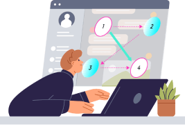
Johannes Gutenberg, the inventor of the printing press, presented a visual pattern that demonstrates how the eye moves across printed text. The visual field is divided into four equal areas. In the past, this was relevant for books, but today it applies to computer screens or smartphone displays as well.
The user's gaze typically moves from the top left, horizontally to the right, diagonally to the bottom left, and then back to the right. As shown in this diagram:

These areas are named "Primary Optical Area," "Strong Fallow Area," "Weak Fallow Area," and "Terminal Area," based on the amount of attention they receive.
The diagram is also often referred to as the Z-pattern because the eye follows a visual "Z" pattern when viewing content. In reality, the eye's movement resembles an inverted "S".
In connection with the Gutenberg Diagram, people also talk about "Reading Gravity," which means that our attention tends to "fall" downwards, with the topmost elements receiving more attention than the lower ones.
Websites designed following the Gutenberg Diagram adhere to this reading gravity, supporting natural reading and information absorption.

Important for proper implementation of the model: The different elements within the schema must be visually distinct from one another. You can achieve this by leaving enough white space between the content and using contrasts to differentiate elements.
When should I use the diagram?
The Gutenberg Diagram is suitable when your website offers only few contents that are relatively simple in design. It is particularly perfect for landing pages where the primary goal is the call-to-action.
The diagram is also excellent for visually guiding your users towards the desired action and providing them with the most important information immediately. Similarly, you can place less important elements in areas that generate the least attention.
How to use the Gutenberg Diagram correctly?
Before applying the Gutenberg principle to your website, you need to ask yourself two questions:
- What is the most important information that users should perceive first?
- What action do you want users to take (e.g., click a button or fill out a form)?
Now, you need to distribute the elements according to the "Z" pattern on your page. You have some flexibility in using the Gutenberg Diagram. You can stretch, compress, or place the "Z" diagonally across the page. The key is to ensure that the fixation points are clearly recognizable, and the reading direction is correct.
For longer pages with a loose design structure, you can apply the schema multiple times in a row and expand it into a zigzag pattern. However, in general, the Gutenberg Diagram is less suitable for long and text-heavy pages.

TIP: The principle works only as long as users are not distracted by other particularly striking elements (e.g., videos).
By the way, the Gutenberg principle combines well with the AIDA model by placing the individual points of the schema in the four areas and guiding the visitor strategically towards becoming a customer. Our comprehensive article on the AIDA model shows you how to apply the marketing schema optimally on your website.
Primary Optical Area
In the primary optical area (top left), the user's attention is the highest. Therefore, you should place the most important elements or your unique offer here. Many companies also use this area to position their company logo, as seen in the example of the Facebook homepage:

Strong Branch Area
The strong branch area (top right) is the field where the attention of users slightly decreases. Here, you can place your secondary important content. This area is suitable, for example, for the search function or the registration field.
Weak Branch Area
The weak branch area (bottom left) is also referred to as the "blind area" because users typically pay little attention to this field. You can use the diagonal between area 2 and 3 for image-heavy content to maintain the user's attention.
Some designers choose to omit this area, creating a so-called "golden triangle," where the focus is on the three main elements of the page.
End Area
In this area, the attention briefly increases again, and the user now wants to know what to do next. Therefore, this field is best suited for placing your call-to-action.
What other design principles are there?
In addition to the Gutenberg Diagram, there are other design principles that you can easily apply to your website. The choice of the right design schema depends on the number and type of contents you offer.
F-Pattern
In addition to the Z-Pattern, there is also the so-called F-Pattern. Similar to the Gutenberg Diagram, the gaze starts at the top right, then quickly moves to the bottom right, and then returns to the left and moves downward. The gaze pattern resembles a large "F".
This pattern was coined in 2006 by web design expert Jacob Nielsen, who used eye tracking to determine that we follow this pattern with our gazes when reading longer texts on the web. The red spots indicate the areas that received the most attention during reading.
Contents and words on the left side are thus more strongly perceived than those on the right side.

To apply the principle correctly, important elements should be placed on the left side, and the central message should be incorporated at the beginning. If you don't capture your users in the first sentences, there is a high chance they will leave.
The F-Pattern comes into play when we don't have other visual points to orient ourselves. This is especially true for longer texts such as blog articles, but also for Google's search results page.
You can break this pattern with bold markings, images, and bullet points to also direct the user's attention accordingly.
A few important insights from the F-Pattern:
- This pattern shows that reading on the internet is completely different from reading in print media. We don't read word by word online but tend to scan the page and only perceive individual areas. Much of the text is skipped, and we only read more closely if something interests us.
- The diagram also reveals that the first one to two paragraphs receive the most attention. Therefore, you should address the most important information at the top.
- Start paragraphs and subheadings with phrases that provide important information. Users are more likely to notice them as they scroll down the page. You can enhance this effect by bolding the relevant words.
Visual Hierarchy
A so-called visual hierarchy visually guides the user towards the desired action - as mentioned above. The schema resembles an inverted pyramid or a funnel and is widely used in modern web design.
The schema usually begins with a large headline intended to capture the user's attention. The elements are often centered on the homepage. At the top of this pyramid, you find the call-to-action, as shown in this example:

The user's gaze goes from the large headline through the brief introductory text to the visually highlighted CTA located below. Different font types and sizes visually separate the individual elements. The two images enhance the emotional effect on the user as they relate to the offer.
The effect can be further strengthened by increasing the white spaces between text blocks. Generally, the website has few distractions, making it easier for users to perform the desired action.
TIP: If you want to learn more about text formatting and design, we recommend our comprehensive article on UX Design.
Ideally, the most important elements should be placed "above the fold," meaning in the topmost area of the website that is visible to the user without scrolling.
Color Scheme
Colors appeal to us on an emotional level and have various meanings. Consider the feelings you want to evoke in your target audience and use appropriate color accents and contrasts.
Almost every color has a specific association. If you want to learn more about which emotions you can evoke with different colors, we recommend our article on Psychology of Sales.
Fazit
There are numerous design principles that you can use for an effective design of your online presence. The choice of the right model depends entirely on your offering and the amount of content you want to convey. Especially for landing pages, the Gutenberg Diagram has proven to be effective.
Always keep in mind that the most important elements should be placed at the topmost position and that navigation for the user should be simple and intuitive. This way, you can convey important information faster and increase your conversion rate.
Stay up to date with us: Our articles are continuously expanded and regularly updated.


